Locrating's catchment areas explained
Using data from the national school census, which has been provided by the Department for Education and the Office for National Statistics, we have created catchment area indicators for schools in England. By explaining what we have done and how, this post allows you to interpret our catchment maps.
We have two styles of catchment area indicator that can be used either individually or together; coloured circles show the concentration of the most recent intake of pupils around the school, whilst area shading shows the neighbourhoods these children live in. For some schools, we also show the last distance offered obtained from local authorities.
Step 1: Find the right pupils
The first step is to identify the latest intake of pupils for each school, as these are the ones we are most interested in. For primary schools this is typically reception year pupils and for secondary schools this is typically year 7 pupils.Our logic ensures that the correct group of children is selected for each school. Where a school is an all through school (i.e. both primary and secondary) we look at the most recent primary age intake. We also ensure that we don’t include children who are looked after or have special educational needs; as these children often get priority over other pupils when it comes to admissions.
Step 2: Work out where these pupils live
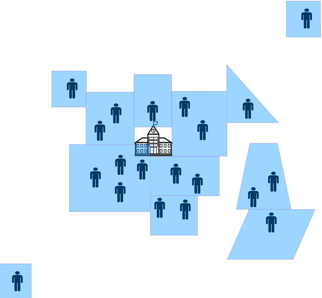
Once we have identified the group of children we are most interested in, we can analyse the data and work out where they live. The diagram below shows an example distribution of reception year pupils who are attending a primary school. For schools that admit based primarily on distance you’ll typically see them distributed fairly evenly around the school.
Step 3: Identify where most of the children live
Next, we apply some mathematics to these locations to work out a radius around each school that contains most of the pupils; by most we mean around 70%. This is the area of highest pupil concentration and an area likely to include future pupils. Where a school admits based primarily on distance, when living in this area, you will have a good chance of success for entry into the school.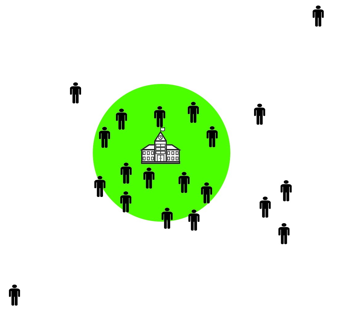
Step 4: Identify where almost all the children live
We apply some further mathematics to work out where approximately 80% of the pupils live. Where a school admits based primarily on distance, when living in this area you will have a chance of success for entry into the school, but less so that being in the green area.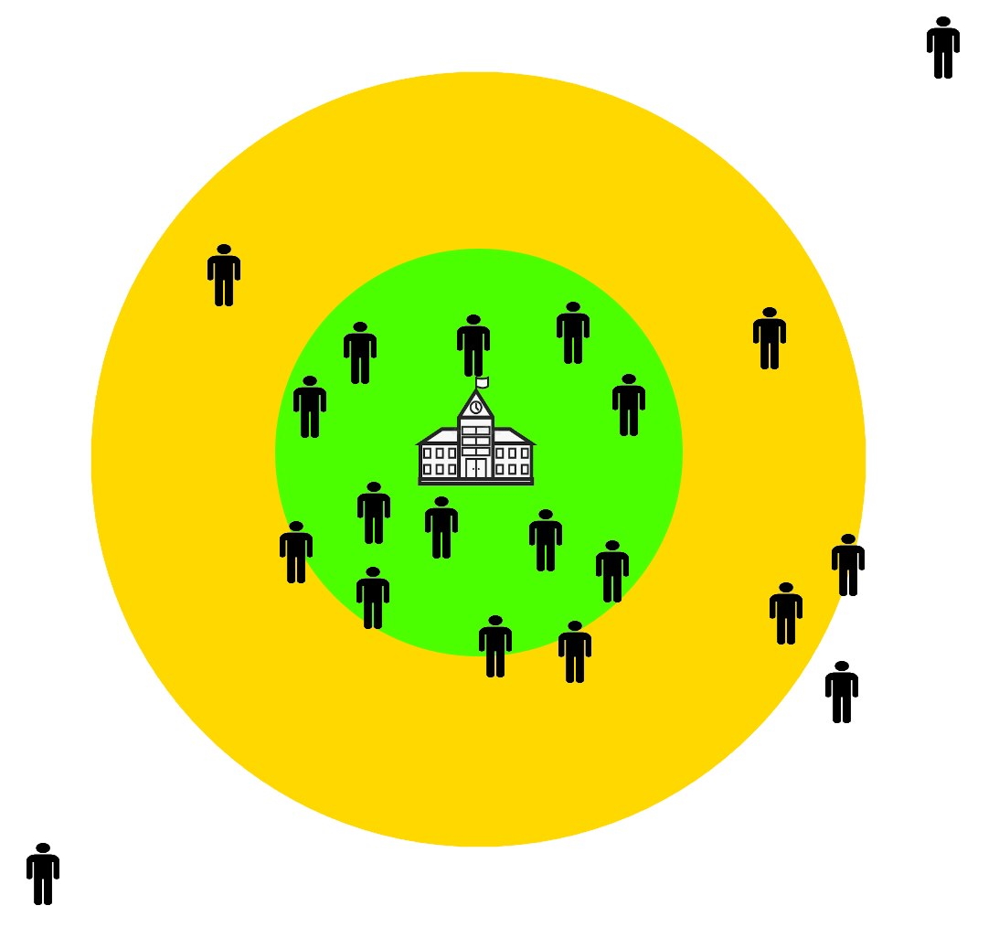
Step 5: Identify the furthest children and remove outliers
Lastly, we shade a circle containing 90% of the children. We drop the furthest 10% because we often find some huge numbers in this group that can skew everything. By removing these outliers from the data, e.g. pupils who were perhaps unusually lucky to get an offer or those who were admitted based on a criteria other than distance, we find our catchment area indicator is much more realistic for normal circumstances.Where a school admits based primarily on distance, when living in this area you will have a chance of success for entry into the school, but less so that being in the green or yellow area.
It should be noted that you have a chance in the red zone and even when living outside this area as catchments can, and do, vary from one year to the next.
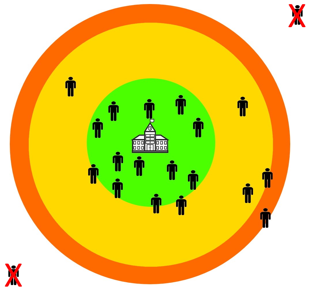
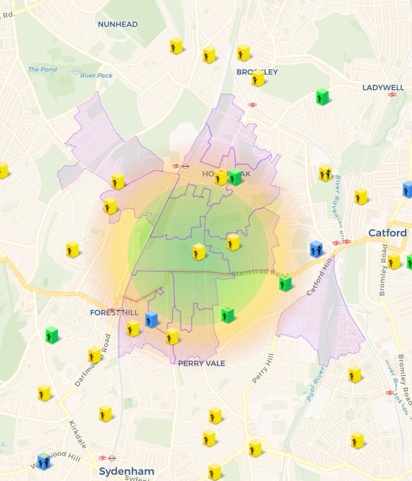
On our site, we don't use such strong boundary lines for these circles, instead we fade the edges; to reflect that they are for guide purpose only and not rigid measures. Below is an example of how the final result appears:
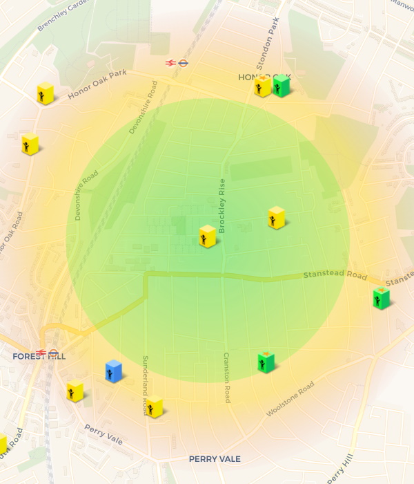
Step 6: Lower super output areas
Our second type of catchment area indicator uses Lower Layer Super Output Areas (LSOA); this sounds complicated, but is actually quite simple. A LSOA is an area on a map, a bit like a postcode, which has been automatically generated by the Government to be as consistent in population size as possible, typically around 1,500 people. So, they are larger in rural areas and smaller in more densely populated areas.By default, we shade the LSOAs containing the most recent intake of pupils, but using the catchment area menu options you can chose to change the academic year (i.e. look back in time to see what happened in previous years) and also the year group of the pupils included (i.e. see where older pupils in the school live).
These shaded areas are interesting as they provide some insight into slightly more unusual factors affecting the catchment area, such as a local authority boundary or preferential area. If you see consistently year after year certain areas shaded and others not, whilst they the same distance from the school, then it is likely there is some area preference in the schools admission policies. We advise you speak to the school to find out more information on this.
Below is an example of how this shading appears on our site, you can choose to view both types of catchments together (as below) or separately, using the options under the map menu:
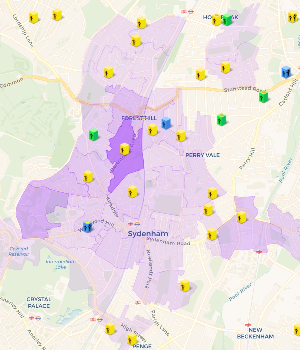
If you set the year group filter to be 'whole school' then (due to the larger number of pupils in each LSOA) we are able to apply shading to indicate the relative number of pupils in each area:
Important Caveats
Whilst out catchment area indicators provide valuable insight into where you might need to live to gain entry into a school, the past does not necessary predict the future. Catchments can, and do, vary from one year to the next. We encourage you to read our catchment area myths blog post.Not all schools admit by distance alone, the above does not take into account policies such as priority on ability (e.g. grammar), faith, siblings, children of staff or lottery systems. Bulge years will also make catchment areas larger in certain years. Out catchment area guides provide valuable insight, but we always advise you speak to the school admissions team.
The Department for Education have specifically asked us to include the following text here: "The criteria in which schools use to allocate places in the event that they are oversubscribed can and do vary between schools and over time. These criteria can include distance from the school and sometimes specific catchment areas but can also include, amongst others, priority for siblings, children of a particular faith or specific feeder schools. Living in an area where children have previously attended a school does not guarantee admission to the school in future years. Always check with the school’s own admission authority for the current admission arrangements."
Comparing Locrating catchment indicators with council cut off distances
Please note that these catchment area indicators show where existing pupils live, this is not the same as the last distance offered under the distance criteron as published by some Local Authorities. We do collected Last Distance Offered for some, but not all, schools in England. See collecting last distance offered data and comparing Locrating's catchment indicators with council cut off distances for more information.Quick start guide
Our quick start guide shows how to change the catchment settings in our map here.
The small print
This work was produced using statistical data from the Office for National Statistics. The use of the ONS statistical data in this work does not imply the endorsement of the ONS in relation to the interpretation or analysis of the statistical data. This work uses research datasets which may not exactly reproduce National Statistics aggregates.
This data is provided for informational purposes only and we do not accept any liability for decisions based on this data. Past admissions are no guarantee of future admissions, we advise you to always check with the school.
Author: Lewis Tandy


