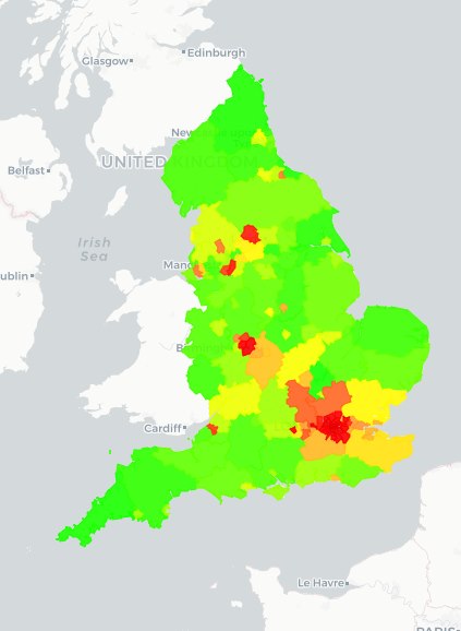
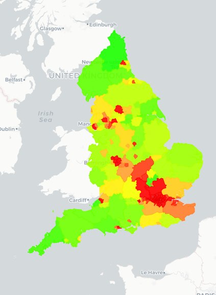
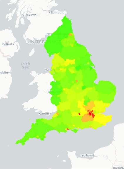
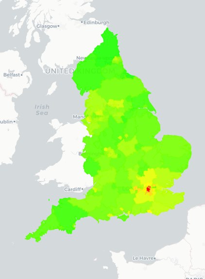
Changes in the percentage of successful primary and secondary school applications over time
It's really interesting to compare admissions data over time, with some clear patterns emerging. Whilst the chances of getting you first choice secondary school appears to have got worse across large swathes of the country in recent years, the opposite appears to be true for primary schools.
It's particularly noticeable when you compare our 2014 and 2019 school admission heatmaps, with quite a few areas moving into the orange or red for secondary schools (which represents a decrease in the number of children who received their first choice school) and quite a few areas moving from yellow to green for primary schools (which represents an increase in the number of children who received their first choice school), as can be seen below:

|  |
| 2014 Secondary School Admissions | 2019 Secondary School Admissions |
 |
 |
| 2014 Primary School Admissions | 2019 Primary School Admissions |
Unfortunately, we can't explain the reasons behind these changes, but it is interesting to see the trends nonetheless. You can find out the pressure on primary and secondary school places in your local authority using our interactive heatmaps.
Author: Lewis Tandy


